Thursday, October 28, 2010

Boo to You!

"Hebert felt positively spooky in his ghost costume."
watercolor, acrylic gauache, watercolor pencil
© 2010 Melanie Linden Chan
In my search for my true-love-of-techniques, I played around with some acrylic gauache. Acrylic gauache is nice because the pigment is more saturated than watercolor, but it can be applied just like watercolor, and once it dries the paint cannot lift off the paper, just like regular acrylics. This was my first try, and as usual I got grumpy from my lack of talent in rendering tiny details with a paintbrush. So I whipped out my long-forgotten watercolor pencils, and behold! I may have found what I've been looking for: a way to paint texturally and keep things nice and tight. When I was about finished, I topped it all off with some caran d'ache textural scribbles for good measure.

FYI, this is also an Illustration Friday topic: spooky. "Hebert felt positively spooky in his ghost costume."

Friday, October 22, 2010

Working from Nature

For the last section in the Introduction to Illustration course, we studied Natural Science Illustration and worked on rendering things from nature with our pencils and inks. 
Acorn Squash and Gerbera Daisies
Pencil and Micron Pen on Bristol Board

The best part about this was that we all got to visit RISD's Nature Lab, which was wonderful. I'm going to have to find a good excuse to sneak away there for a couple of hours, because they have so many animals and things in their storage, and I only had time to draw ONE owl... and they have three! He still needs some work, but isn't he so fluffy and cute? :)
Great Horned Owl (fairly certain it is, anyway)
2H Pencil on Strathmore Drawing Paper
(Thanks, Jess, for the pencil!)

I will keep both of these images in my online portfolio, probably in the Sketchbook and Fine Art sections. 

Even though I've had experience in all three sections, (Children's Book Illustration, Comics, and Natural Science Illustration), taking this Intro course was helpful because it confirmed my suspicions: that I love to draw pretty much anything. I got a few more pieces to put in my portfolio, got a better idea how I want to do Bungee Bunny's book when the time comes, and got really vamped up about drawing more from life.

In all, I got quite a bit out of this course, which goes to show that one learns something new every day. Or re-learns. Hoot to that!

Other Ways I Spend My Time: Navy Birthday Cake

A customer asked if I would decorate a cake honoring the United States Navy's 235th Birthday, so here it is!


Happy Birthday to the U.S. Navy! Thank you for your service!

Building Characters builds... er, character!

Some of my most recent lessons (for both classes) have been about creating character profiles and character traits. For my illustration class, I chose to work with a little dude I made up years ago, who will be starring in his own picture book in the future. I've got his story all ready and waiting, so when I am finished with Super-Secret Project #1, and perhaps a #2, Bungee Bunny will become Project #3.

Anyhow, in the Introduction to Illustration course we talked about comic art, and the different styles it can be drawn, and how artists tell their stories with pictures.  But the number one thing of importance is your character, who needs to feel real all on his/her own. Our assignment was then to create a character, draw him from different angles, and show why he is special.

Bungee Bunny character art.
Bungee Bunny is the property of Melanie Linden Chan!

(Please forgive the watermarks, but as my little guy is so cute, he will be coveted. Kindly refrain from stealing him from me, because I have big plans for him and I'd rather my dreams not be crushed. Much appreciated.)

We also talked about this in the Book Dummy class; how your character must really be his own self, and look and act consistent throughout the story. Some students chose to draw their characters mimicking a favorite artist, (for example, how would Bungee look if Van Gogh painted him? What colors, textures, or lines would he use?), or picked out swatches of fabric patterns that their character would wear or like. Then we all did character art and turnarounds, although mine isn't quite web-ready yet so I will share it with you soon.

Character art is a great way to get yourself ready for producing a comic book, graphic novel, or a children's picture book. Do one for each of the characters in your story- you won't regret it!

Sunday, October 17, 2010

Field Trip: The Rhode Island Festival of Children's Books and Authors

It's been a crazy week (I'll spare you the heartache and leave it up to your imagination), so I welcomed the thought of finally getting to the Lincoln school in Providence to attend The Rhode Island Festival of Children's Books and Authors. I had missed it last year and made "To Lincoln or Bust" my mantra for 2010.

Well, I made it! and It. Was. Awesome.

I only wish I knew how to be in two places at once, because while one presentation was going on, another room was filling up with people in line to get their books signed by favorite authors and artists. I hate picking and choosing, because one never knows what one might have learnt, but I did my best.

The Beautiful Lincoln School, Providence, RI

Front display greets guests


Kazu Kibuishi

Jules Feiffer


I almost walked straight into Rotten Ralph in the hall!

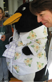
Tacky the Penguin

Mark Teague

Helen Lester

Chris Van Allsburg
David Macaulay

Hilarious Mo Willems (posing for our cameras)

THE famous Knuffle Bunny, who has been around the world!
Yes, I'm supposed to be in the photo, but I miraculously
disappeared when I cropped me out in Photoshop...
 I regret missing a few presentations, (including Chris Van Allsburg's because I had to leave early for work) but it really was a great time! I think I will make it my goal to go every year from now on. And what was the very BEST part of my day?

Coming home with this:


Yep, worth every minute. :)

Tuesday, October 5, 2010

Latest Technique Test

It will soon be time to decide which technique I will use for my Book Dummy, and I still haven't any clue.  Some days I want my story to have the sketchy look, with lots of interesting lines and patterns, and an antiqued tone to the color scheme. Other days I want the more traditional watercolor look and brighter colors... and then there are days like today where I have no idea so I just play with my materials to see what I come up with.

I had a piece of Arches 140lb hot-pressed watercolor paper that had been coated in gesso and still taped to the board lying around my studio, so I decided to use that up. Though I don't always use it, I really enjoy looking at texture in an illustration, so this was my golden opportunity. The gesso'd paper showed lovely brush strokes and it made the paper more durable for scuffing and scrubbing.


 I didn't have much of a plan, so I just sketched with my favorite blue drafting pencil, then a regular No. 2 pencil. And although I know fully well that gesso is an acrylic material, I went ahead and used a bit of brown ink wash to add some toning. It worked all right, so I thought I would test my luck and see what happened if I used watercolor.

And as we all would have guessed, not a good idea. But hey, at least I know.

To be honest, I was actually putting off using acrylic paints. They're messier than watercolors and harder to control (never thought I would say that!) because the paint can get rather blobby and it is hard to get in small details. And once they dry on the palette, there's no way of reusing the product, so it can also be wasteful. But at this point I had no choice, so I tried to pump myself up by putting on some Lady Gaga music on the Pandora channel. This helped.

I stuck with three colors: Cad Yellow Light, Cad Red Medium, and Cerulean; plus white and the inevitable black, but only because the sheep is a black sheep. I try not to use black in my art anymore, unless it is  necessary.

And of course I forgot that I should have been using the Matte Medium all along, but I remembered in time before I called it quits! This stuff is relatively new to me, even though I had it with my paints for ages, I never really figured out how to use it until this year. I painted the darkest areas first, then worked my way up so I could do a bit of glazing with the lighter colors.

Then I topped it all off with Caran d'ache water soluble crayons, (I chose these because the colored pencils didn't want to work, and pastels wouldn't have either, and I don't have oil based crayons to use) and scrubbed and rubbed until it was nicely textured.

And then my least favorite characteristic of acrylics chose to show itself: lack of clean edges! I know, it's my own fault for working so messy, but I have seem to have lost some patience on that part. I cleaned them up a bit with a "shade of grey" brush-tipped pen, and I'm happy to say that it worked rather well.

In fact, I'm pretty proud of my accomplishment of the day!

Last but not least, I have a scanner comparison to share with you. The image above was scanned with a larger format scanner, the Mustek ScanExpress A3 USB 1200 Pro. The image below was scanned using an Epson V500. The Mustek is still new to me, and I am unfamiliar with the settings, but the Epson is an old friend. Because I know what settings to use, you can see more detail and texture in the Epson image. I will do more comparisons as I learn how to use the large format scanner better, so that I might be able to help someone make an educated decision when purchasing a scanner.


Thanks for reading! Have a nice week!